Building this Blog

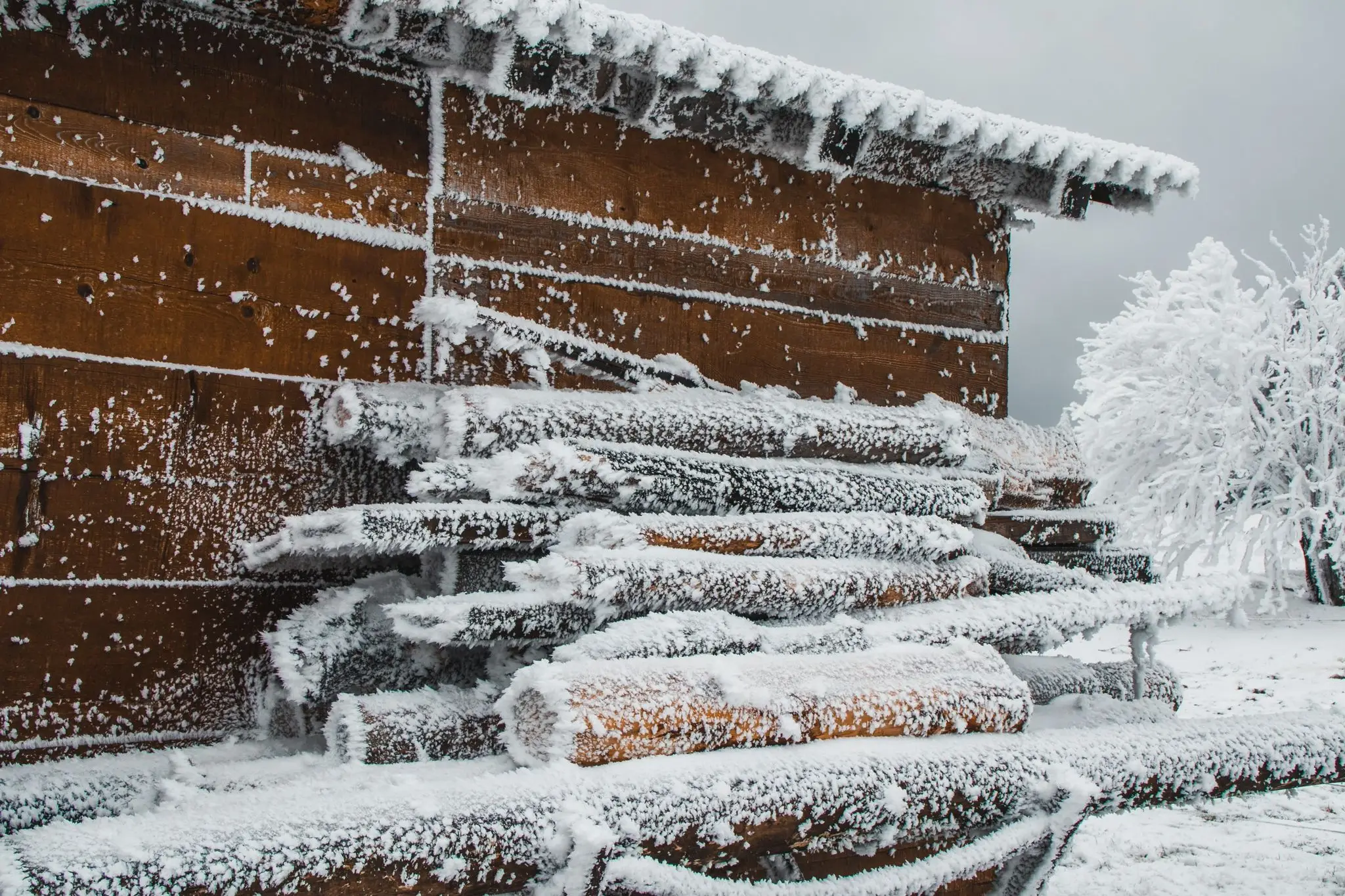 Photo by Oana Vasilescu
Building a digital blog should not be, theoretically, too hard to accomplish. Expecially now, in 2022, with all the many dedicated platforms and services that have established themselves over time in the digital blogging department.
As someone who does Frontend Development for a living, my list of technical choices is even more generous. I am able, theoretically, to build a web application using just the magic trio of HTML, CSS and JavaScript. Just in case I don't feel like going full vanilla, there are superior levels of abstractions, such as, for example, the ReactJS, tailwindcss and TypeScript combination. Of course, one level of abstraction above, the list continues with the likes of GatsbyJS or NextJS. And just in case I don't want to bother with coding at all, I can go full techless with solutions such as WordPress, MailChimp, Canva, or something equivalent. The last list of services can also provide support for hosting and domain registration, at a cost, obviously.
So, time to choose one technology stack and ... start writing already?
Picking the Tech Stack
The technical solution for this blog is a middle ground between tech skills and convenience. Let's talk about each part.
Github
First and foremost, the source code for the blog needs to live somewhere. Sure, we can keep it safe on a laptop, but what if the device gets damaged, or the code gets accidentally deleted? So much precious information lost, forever. We cannot risk that. It will also be hard to keep track which of the files got updated and need to be published in order for the next blog version to be released. Luckily, we have GitHub to help us with keeping our code safe, versioned and structured for review. The source code for the blog can live happily ever after inside a GitHub code repository. Specifically, this repository.
Docusaurus
The second tech stack choice is docusaurus, which provides us with the infrastructure to build the blog. We can write each blog post as a MDX markdown file that will be transformed automatically into a web page. Docusaurus allows further customisation of the page layout using a technique called swizzling. We can replace or alter different layout components using everyone's favorite library, ReactJS.
All the source code (markdown, react javascript, others) is transformed into production code by docusaurus. This process is called the build process, and its result, the production code, is the blog aplication itself. With great support out of the box for responsiveness, layout, images, tags, code snippets and even interactive code examples, docusaurus does a lot of the heavy lifting and lets me focus on the content.
Netlify
Great, now we can write my blog source code, save it somewhere safe and build the blog from it. Anything else?
Well, turns out that in order to write www.silviuaavram.com in a browser and actually access the blog website, its production code needs to find its way back to the browser. Also, every time the blog receives an update and, as consequence, has the source code changed, the production code needs to be updated as well. Otherwise, we will read an outdated blog, which is totally unacceptable.
Consequently, a computer on the internet needs to be able to download the blog source code from GitHub, build it into production code, and serve the resulting production code to the browser that wants to retrieve it. This magical computer is called a server. When someone requests a link in the browser, this server needs to be found and asked to ... serve ... the website production files. These files will be received by the browser, which will piece them together and show us the blog website.
For these daunting tasks we will choose Netlify, since I had a great experience with their service when hosting the downshift docsite.
GoDaddy
Finally, this server computer needs to be linked to the address
www.silviuaavram.com through a service called the Domain Name System. As such,
we need to buy the address (domain) silviuaavram.com on the internet and tell
Netlify that it belongs to us. In turn, Netlify can provide the actual website
content every time someone requests the www.silviuaavram.com. The process of
mapping the internet address to the IP address of the Netlify server is done by
the internet using the DNS. We will use GoDaddy
to buy the silviuaavram.com domain.
And that's all I need, finally let's get to work!
Source Code Setup
There are some standard prerequesites that we need. Most FrontEnd developers already are familiar with them:
- GitHub account.
- Installed NodeJS and Git on the laptop.
- VSCode.
If you don't have these set up, the internet is your friend in order to have them ready.
GitHub
We will create a new GitHub repository called
silviuaavram, make it Public, with a node .gitignore file and an
MIT license. Afterwards, We will download the repo to our laptop as well, so
we can make changes locally and then save them on GitHub once they are done.
We will open VSCode with a terminal, navigate to a place where we want to have the repo, and download it:
git clone git@github.com:silviuaavram/silviuaavram.git
Docusaurus
Second step is to setup docusaurus locally according to the docusaurus documentation. We want to have the initial code generated by docusaurus in the folder we just downloaded from GitHub, so we will run the setup command like this:
npx create-docusaurus@latest silviuaavram classic --typescript
cd silviuaavram
npm start
It will create a standard docusuaurus setup, in the folder silviuaavram, using
TypeScript instead of JavaScript for the related source files. After the
files get created, we will navigate inside the folder and run the npm start
command in order to see how the website looks right now. It will get deployed
locally at the address http://localhost:3000.
For now, we want to save the generated files to GitHub, so we will stage all of them, create a commit from the staged files, and push the changes to the remote GitHub repository.
git add -A
git commit -m "docusaurus setup"
git push
If you are unsure about the git-related concepts like commit, push, clone, stage etc. the Internet is, again, your friend.
Final Setup Tweaks
We will remove the package-lock.json file and create, instead, an .npmrc
file with the content below, so we don't get the package-lock.json generated
again. It is a matter of personal preference not to have one, mostly because
there won't be many people working on this blog.
package-lock=false
We already have the .gitignore file generated, but we will also add a line
with .docusaurus at the end of it, since this is going to be a directory with
generated code, and we don't want to save it on GitHub.
Since I like to format my code automatically as I write it, we will be using the
prettier utility, along with a configuration file from kcd-scripts. Only the
prettier extension from VSCode is useful, so we will not install prettier for
now. But we will install kcd-scripts as a developer dependency.
npm install --save-dev kcd-scripts
And we will also create a prettier.config.js file in the root with the
following content:
// this is really only here for editor integrations
module.exports = require('kcd-scripts/prettier')
Now, every time we run the formatting command in VSCode, the code will get
formatted according to the formatting rules from kcd-scripts. Great!
Removing the Docs. Defaulting the Blog.
Let's now shave the parts of our app that we don't need. Most of these steps are done according to Docusaurus' official documentation, as it's very well written.
Since we only need the blog part of the application, we are going to delete
the support for documentation (docs). In docusaurus.config.js, we will look
for the config.presets. Inside it, there is a docs entry, whose value is an
object. We will replace the object with false. This should remove the docs
part from the website.
Changing the value will result in a strange error displayed in our locally
deployed application. To fix the error, we need to add routeBasePath: '/' to
the blog object (next to the docs entry). We will also remove the first item
in config.themeConfig.navbar.items (the one with type 'doc').
We also need to remove a few files as well. First and foremost, all the content
in the src/pages directory should be deleted, since they are related to the
docs part of the app. We can clear src/components as well, since these
components are used only in the pages we just deleted. Oh, and we also won't
need sidebars.js anymore, so we can get rid of that.
These changes should remove all the references to the docs, and the error
should be fixed. We also made the blog page as default, so when we navigate to
localhost:3000, it will display the blog. Fantastic!
Back in our docusaurus.config.js file, we need to also change the navbar item
pointing to the blog to point to '/' instead of '/blog', due to our previous
change with routeBasePath. We should also deal with the footer section. This
one is really easy, for now, as we will only remove the whole links part,
keeping only the style and copyright. The links to social media stuff will
be added a bit later in the navigation bar.
So far, the config file should look like this:
docusaurus.config.js
// @ts-check
// Note: type annotations allow type checking and IDEs autocompletion

const lightCodeTheme = require('prism-react-renderer/themes/github')
const darkCodeTheme = require('prism-react-renderer/themes/dracula')

/** @type {import('@docusaurus/types').Config} */
const config = {
  title: 'My Site',
  tagline: 'Dinosaurs are cool',
  url: 'https://your-docusaurus-test-site.com',
  baseUrl: '/',
  onBrokenLinks: 'throw',
  onBrokenMarkdownLinks: 'warn',
  favicon: 'img/favicon.ico',

  // GitHub pages deployment config.
  // If you aren't using GitHub pages, you don't need these.
  organizationName: 'facebook', // Usually your GitHub org/user name.
  projectName: 'docusaurus', // Usually your repo name.

  // Even if you don't use internalization, you can use this field to set useful
  // metadata like html lang. For example, if your site is Chinese, you may want
  // to replace "en" with "zh-Hans".
  i18n: {
    defaultLocale: 'en',
    locales: ['en'],
  },

  presets: [
    [
      'classic',
      /** @type {import('@docusaurus/preset-classic').Options} */
      ({
        docs: false,
        blog: {
          routeBasePath: '/',
          showReadingTime: true,
          // Please change this to your repo.
          // Remove this to remove the "edit this page" links.
          editUrl:
            'https://github.com/facebook/docusaurus/tree/main/packages/create-docusaurus/templates/shared/',
        },
        theme: {
          customCss: require.resolve('./src/css/custom.css'),
        },
      }),
    ],
  ],

  themeConfig:
    /** @type {import('@docusaurus/preset-classic').ThemeConfig} */
    ({
      navbar: {
        title: 'My Site',
        logo: {
          alt: 'My Site Logo',
          src: 'img/logo.svg',
        },
        items: [
          {to: '/', label: 'Blog', position: 'left'},
          {
            href: 'https://github.com/facebook/docusaurus',
            label: 'GitHub',
            position: 'right',
          },
        ],
      },
      footer: {
        style: 'dark',
        links: [
          {
            title: 'Community',
            items: [
              {
                label: 'Stack Overflow',
                href: 'https://stackoverflow.com/questions/tagged/docusaurus',
              },
              {
                label: 'Discord',
                href: 'https://discordapp.com/invite/docusaurus',
              },
              {
                label: 'Twitter',
                href: 'https://twitter.com/docusaurus',
              },
            ],
          },
          {
            title: 'More',
            items: [
              {
                label: 'Blog',
                to: '/',
              },
              {
                label: 'GitHub',
                href: 'https://github.com/facebook/docusaurus',
              },
            ],
          },
        ],
        copyright: `Copyright © ${new Date().getFullYear()} My Project, Inc. Built with Docusaurus.`,
      },
      prism: {
        theme: lightCodeTheme,
        darkTheme: darkCodeTheme,
      },
    }),
}

module.exports = config
Making it Personal
We're in a good spot right now, as we only have the Blog functionality in our app. However, our blog is about Docusaurus, while we actually want to write personal stuff here. Let's apply some cosmetic surgery and make it beautiful.
Back in our beloved docusaurus.config.js file, we will add our own information
to the relevant fields.
- title should be Silviu Alexandru Avram.
- tagline should be Silviu's personal blog, focused on technology and
lifestyle.
both the title and tagline end up in the HTML file in their appropriate
<head>child elements. - url is our domain that we just bought from Mr. GoDaddy, https://silviuaavram.com.
- favicon becomes img/favicon.png.
The favicon is placed in the Browser tab before the blog title. To create this favicon as a
.pngfile, I used Adobe Illustrator. Guess what's my favorite drink. - organizationName should be the GitHub user name, here silviuaavram.
- projectName should be the repository name, here also silviuaavram.
- editURl from the
blogobject should point to our GitHub repository, specifically 'https://github.com/silviuaavram/silviuaavram/tree/main'The edit URL is a very handy feature in case anyone wants to edit the content of a blog post directly from the website.
- colorMode should have it's defaultMode dark, as we want, by default, the
website to be shown in the dark color mode. We're so dark right now.
Color mode can still be switched to ligh from the toggle button in the upper right color of the screen.
- navBar should have the following changes:
- title should be, obviously, Silviu Alexandru Avram, which is actually the text content of the upper left link to the home page.
- logo should be displayed next to the title, and it should be the blog's logo
picture.
  logo: {
    alt: 'silviuaavram logo with a tequila glass and blog owner name initials',
    src: 'img/logo.png',
  },
I used Adobe Ilustrator here as well, in order to create a logo for the website. Both the favicon and the logo files are saved in the
static/imgfolder. - the navbar items should contain, on the left side, next to the logo, the
links to the Blog and the About pages.
  items: [
    {to: '/', label: 'Blog', position: 'left'},
    {to: '/about', label: 'About', position: 'left'},
// next items. - on the right part of the navbar, before the dark/light mode switch button, I
will place the links to all my social media contacts: GitHub, Linkedin,
Instagram and Twitter. This part involves a little more work than just
adding the information below to the config file. The process is detailed in
the next section.
  {
    href: 'https://github.com/silviuaavram',
    label: 'GitHub',
    position: 'right',
    icon: 'github',
  },
// next items. - last, but not least, we will change the copyright text in the footer to include the author's name.
With all these changes done, our config file should look more or less like this:
docusaurus.config.js
// @ts-check
// Note: type annotations allow type checking and IDEs autocompletion

const lightCodeTheme = require('prism-react-renderer/themes/github')
const darkCodeTheme = require('prism-react-renderer/themes/dracula')

/** @type {import('@docusaurus/types').Config} */
const config = {
  title: 'Silviu Alexandru Avram',
  tagline: `Silviu's personal blog, focused on technology and lifestyle.`,
  url: 'https://silviuaavram.com',
  baseUrl: '/',
  onBrokenLinks: 'throw',
  onBrokenMarkdownLinks: 'warn',
  favicon: 'img/favicon.png',

  // GitHub pages deployment config.
  // If you aren't using GitHub pages, you don't need these.
  organizationName: 'silviuaavram', // Usually your GitHub org/user name.
  projectName: 'silviuaavram', // Usually your repo name.

  // Even if you don't use internalization, you can use this field to set useful
  // metadata like html lang. For example, if your site is Chinese, you may want
  // to replace "en" with "zh-Hans".
  i18n: {
    defaultLocale: 'en',
    locales: ['en'],
  },

  presets: [
    [
      'classic',
      /** @type {import('@docusaurus/preset-classic').Options} */
      ({
        docs: false,
        blog: {
          routeBasePath: '/',
          showReadingTime: true,
          // Please change this to your repo.
          // Remove this to remove the "edit this page" links.
          editUrl: 'https://github.com/silviuaavram/silviuaavram/tree/main',
        },
        theme: {
          customCss: require.resolve('./src/css/custom.css'),
        },
      }),
    ],
  ],

  themeConfig:
    /** @type {import('@docusaurus/preset-classic').ThemeConfig} */
    ({
      colorMode: {
        defaultMode: 'dark',
      },
      navbar: {
        title: 'Silviu Alexandru Avram',
        logo: {
          alt: 'silviuaavram logo with a tequila glass and blog owner name initials',
          src: 'img/logo.png',
        },
        items: [
          {to: '/', label: 'Blog', position: 'left'},
          {to: '/about', label: 'About', position: 'left'},
          {
            href: 'https://github.com/silviuaavram',
            label: 'GitHub',
            position: 'right',
            icon: 'github',
          },
          {
            href: 'https://www.linkedin.com/in/silviuaavram',
            label: 'LinkedIn',
            position: 'right',
            icon: 'linkedin',
          },
          {
            href: 'https://www.instagram.com/silviuaavram/',
            label: 'Instagram',
            position: 'right',
            icon: 'instagram',
          },
          {
            href: 'https://twitter.com/silviuaavram',
            label: 'Twitter',
            position: 'right',
            icon: 'twitter',
          },
        ],
      },
      footer: {
        style: 'dark',
        copyright: `Copyright © ${new Date().getFullYear()} Silviu Alexandru Avram. Built with Docusaurus.`,
      },
      prism: {
        theme: lightCodeTheme,
        darkTheme: darkCodeTheme,
      },
    }),
}

module.exports = config
Icons for Social Media Links
To add a link to the author's Twitter account in our blog's navigation bar, we
can add the following object to themeConfig.navbar.items in
docusaurus.config.js.
  {
    href: 'https://twitter.com/silviuaavram',
    label: "Silviu's Twitter link",
    position: 'right',
    icon: 'twitter',
  },
By default, if we add an item to the navbar items, it will get shown on our website as link with the Silviu's Twitter link text and an external link icon next to it. That's acceptable, but let's create something thats more sophisticated than that. What we want to show is the actual logo of the social media that we're linking to. I mentioned above that Docusaurus allows the customisation of different parts of the layout and content for the website using a technique called Swizzling, and that's what we're going to do. We are going to Swizzle the navigation component in order to change it according to our needs.
We will run the command below in the terminal for a list of React components that can be swizzled.
npm run swizzle -- --list
In the long list of customizable components, we find NavbarItem/NavbarNavLink
that represents the icon link we want to change. That is what we're going to
sizzle, my nizzle.
There are 2 ways to swizzle:
- wrap the corresponding react component into another component, which makes sense if we want to augment it with our own custom stuff.
- eject the component completely, so we can change its default implementation.
We will do the second part, as we want to remove the link text, the ugly icon, and return just our own cool social media icon.
npm run swizzle @docusaurus/theme-classic NavbarItem/NavbarNavLink -- --eject
And confirm that yes, we know what we are doing. We will hit the Enter key slightly harder than usual, to show that we mean business.
Magic! In our src/theme folder we got a generated NavbarItem folder with the
NavbarNavLink.js file. The file contains the default implementation for the
navigation bar link, which is the element that we want to change if the link is
a social media link. Notice that, in our docusaurus.config.js, for each social
media element, we are also passing an icon property, which represents
information about what icon we want to show for that link.
After skimming the code here and understand what's what, we find the default
implementation for the external link. As we expected, it outputs the text via
the label (in this case, "Silviu's Twitter link"), and if it's an external
link (here it is external) it will show the IconExternalLink component next to
it, which outputs the icon with the arrow.
  children: (
    <>
      {label}
      {isExternalLink && (
        <IconExternalLink
          {...(isDropdownLink && {width: 12, height: 12})}
        />
      )}
    </>
  ),
We will change this code and only return a social media icon if, from the
configuration file, we identify that the link we want to show is a social media
link. Otherwise, we will return the default implementation. In order to be sure
that we are dealing with a social media link, we will check its icon prop,
since, from the configuration file, we will only pass icon to the social media
links. The code becomes:
  children: icon ? (
    <SocialMediaIcon type={icon} aria-label={label} className={styles.iconImg} />
  ) : (
    <>
      {label}
      {isExternalLink && (
        <IconExternalLink
          {...(isDropdownLink && {width: 12, height: 12})}
        />
      )}
    </>
  ),
And we will also create a SocialMediaIcon component like the one below, where
each variation will return an SVG output representing the icon tiself:
type SocialMediaIconType = 'twitter' | 'instagram' | 'github' | 'linkedin'

export type SocialMediaIconProps = React.ComponentPropsWithoutRef<'svg'> & {
  type: SocialMediaIconType
}

const SocialMediaIconComponent: Record<
  SocialMediaIconType,
  React.FunctionComponent<React.ComponentPropsWithoutRef<'svg'>>
> = {
  github: GitHub,
  linkedin: LinkedIn,
  twitter: Twitter,
  instagram: Instagram,
}

export function SocialMediaIcon({
  type,
  ...rest
}: SocialMediaIconProps): JSX.Element {
  const IconComponent = SocialMediaIconComponent[type]

  return <IconComponent {...rest} />
}
And one of the icons can be:
export default function GitHub(
  props: React.ComponentPropsWithoutRef<'svg'>,
): JSX.Element {
  return (
    <svg
      height="24"
      width="24"
      viewBox="0 0 32 32"
      xmlns="http://www.w3.org/2000/svg"
      {...props}
    >
      <title />
      <g
        data-name="github coding dev developer"
        id="github_coding_dev_developer"
      >
        <path
          fill="currentColor"
          d="M16,3a13,13,0,0,0-3.46,25.53,1,1,0,1,0,.53-1.92,11,11,0,1,1,7-.4,15.85,15.85,0,0,0-.3-3.92A6.27,6.27,0,0,0,24.68,16a6.42,6.42,0,0,0-1.05-3.87,7.09,7.09,0,0,0-.4-3.36,1,1,0,0,0-1.1-.67,8,8,0,0,0-3.37,1.28A11.35,11.35,0,0,0,16,9a13.09,13.09,0,0,0-3,.43A5.74,5.74,0,0,0,9.62,8.25a1,1,0,0,0-1,.66,7.06,7.06,0,0,0-.37,3.19A7.15,7.15,0,0,0,7.2,16a6.66,6.66,0,0,0,5,6.28,7.43,7.43,0,0,0-.15.79c-1,.06-1.58-.55-2.32-1.48a3.45,3.45,0,0,0-1.94-1.53,1,1,0,0,0-1.15.76A1,1,0,0,0,7.35,22c.16,0,.55.52.77.81a4.74,4.74,0,0,0,3.75,2.25,4.83,4.83,0,0,0,1.3-.18h0a1,1,0,0,0,.29-.14l0,0a.72.72,0,0,0,.18-.21.34.34,0,0,0,.08-.09.85.85,0,0,0,.06-.17,1.52,1.52,0,0,0,.06-.2v0a4.11,4.11,0,0,1,.46-1.91,1,1,0,0,0-.76-1.65A4.6,4.6,0,0,1,9.2,16a4.84,4.84,0,0,1,.87-3,1,1,0,0,0,.24-.83,5,5,0,0,1,0-1.85,3.59,3.59,0,0,1,1.74.92,1,1,0,0,0,1,.23A12.49,12.49,0,0,1,16,11a9.91,9.91,0,0,1,2.65.43,1,1,0,0,0,1-.18,5,5,0,0,1,2-1,4.11,4.11,0,0,1,0,1.91,1.05,1.05,0,0,0,.32,1A4,4,0,0,1,22.68,16a4.29,4.29,0,0,1-4.41,4.46,1,1,0,0,0-.94.65,1,1,0,0,0,.28,1.11c.59.51.5,4,.47,5.36a1,1,0,0,0,.38.81,1,1,0,0,0,.62.21,1.07,1.07,0,0,0,.25,0A13,13,0,0,0,16,3Z"
        />
      </g>
    </svg>
  )
}
The actual SVG code is copied from a website that provides these icons for free. I chose iconfinder.com as the place to get the icons. Many thanks to them!
About Section and Images
Let's begin the creative journey by writing the About page. It's pretty standard across blogs such as ours, since it reveals a bit about the author, their experience, what they enjoy doing etc.
We will create an about.tsx file in the pages directory, with the following
content, for now:
import React from 'react'

export default function About() {
  return <div>Hello from Silviu!</div>
}
With Docusaurus' magic, when we navigate to localhost:3001/about, or by clicking the About link in the navbar that we just created, we will be greeted by a brand new page created for us automatically, displaying the Hello from Silviu message.
We will structure the About page in multiple sections. Each section will
contain one image and one subsection with text paragraphs. Since the page is
going to be built fully by us, it means that we are responsible for making it
look great on any device. It must look great on a wide computer screen as well
as on a small phone display. To achieve this, we will use responsive design
techniques, with relative sizes and layout shifts. The styling will be done with
a separate CSS file, about.module.css, which will contain the CSS
declarations. These declarations will be imported in the .tsx file and applied
to the elements that need to be styled, like below:
  // in about.tsx
  <section className={`${styles.sectionContent} ${styles.sectionLargerContent}`}>
/* in about.module.css */
.sectionContent {
  flex-grow: 1;
}

.sectionLargerContent {
  flex-basis: 540px;
}
The layout we want to achieve is the following:
- on small screens, add both the image and content on the same column.
- on wide enough screens, move the content and image side by side on separate columns.
- on all screens, make the image and content sizes dynamic, so they can grow along with the display size.
- in the cases where we consider that the sections width is large enough, we will prevent the sections from growing, and instead add a dynamic horizontal margin between them and the screen edge, so they stay centered.
After carefully observing how our content looks on different screen widths, we will create the following break points in our app:
- up until 640 pixels, we will have only one column, for both images and content, and the column will grow as big as the screen.
- between 640 pixels and 1020 pixels, we will keep the same 1-column design, but we will stop it from growing as well. Instead, we will center this column, and add left and right margins to compensate for the rest of the width.
- 1020 pixels and 1280 pixels, we will perform a layout shift, and we will move the images and the content sections in separate columns, side by side. We will also let them grow dynamically if there is more space to go around.
- at 1280 pixels and above, we will keep the sections with 2 columns, but we will block their width at 1280 pixels, and perform the same horizontal margin like we did on point 2.
The important thing to know here is that we will choose to display responsive images. We will serve different sizes of images for different size of displays, as it is not necesary to send, over the network, a full size image if you are viewing the page on a phone.
For example, this will be the markup for the first author image:
<img
  className={`${styles.sectionImage} ${styles.sectionPortraitImage}`}
  alt="silviu sitting in front of to the fountain in piazza de ferrari in genoa"
  src="/img/pictures/silviu-about-the-author-1800w.jpg"
  srcSet="/img/pictures/about-author-400w.jpg 400w, /img/pictures/about-author-600w.jpg 600w, /img/pictures/about-author-800w.jpg 800w, /img/pictures/about-author-1000w.jpg 1000w, /img/pictures/about-author-1200w.jpg 1200w, /img/pictures/about-author-1500w.jpg 1500w, /img/pictures/about-author-1800w.jpg 1800w"
  sizes="(max-width: 639px) 100vw, (min-width: 640px) and (max-width: 1019px) 608px, (min-width: 1020px) and (max-width: 1279px) 40vw, (min-width: 1280px) 522px"
/>
Whoa, whoa, whoa! The only thing we can tell from the markup above is the arrogant alt text for the image. But not to worry, here's what's happening. After playing around with the page in the Chrome DevTools' Device Toolbar, we can check what size will our image take depending on the size of the viewport and the layout that's displayed. Consequently, when our image shares the same column with the text content (up until 1020px width), its width varies between 0 and 608 pixels. When it has a separate column from the text content, its width varies between 415 and 522 pixels.
With this data gathered successfully, we will fill the sizes attribute of the
<img> element, informing it about its size. By itself, the <img> cannot know
this information, since it's oblivious to the css that's going to be apllied
to it. So, with the sizes atttribute, we are helping it with this information.
Now, we also need to provide our <img> friend with a multitude of image sizes
to choose from, with the help of the srcSet attribute. Our friend is smart
enough to do the math, at least, and it will calculate the viewport width,
multiply it by the DPI factor of the device, check via the sizes attribute
what picture size it needs, and chooses the appropriate one via srcSet. And by
appropriate, I mean the smallest one possible without making any compromise in
quality.
For example, on a 3x DPI ratio phone with a 390 pixels width screen, it should pick the 1200w picture to display, since the picture itself uses the whole screen horizontally.
We will create, consequently, different picture copies, one for each size. I
used Image Resizer since I was pretty happy with
the result and the experience for generating the images we need. We will add the
downloaded pictures in the static/img/pictures folder.
With the responsive images part dealt with, we can focus on writing and finish the author page. For example, this is the markdown for the header part of the page, with both paragraphs and a picture next to them.
Header Code.
<header>
<article>
<h2>About the author</h2>
<section className={styles.aboutTheAuthor}>
<section>
<p>
Hi, I'm Silviu, and I'm a software engineer 👨💻. When I'm not coding, I
spend my time playing basketball 🏀, salsa dancing 🕺 and drinking
cofee ☕️. I also drink coffee when coding, so there's that.
</p>
<p>
I believe that writing is an important way to improve myself and
others. If I write about a particular subject, without someone
explicitly forcing me to do it, it means that I aim to understand that
subject well enough. And I consider it important enough to share it
with someone else. It's the reason why I built this blog, to thing and
write about stuff that is helpful to me and can also be helpful to
others.
</p>
<figure>
<blockquote cite="https://youtu.be/bfDOoADCfkg">
<p>
<i>
Thinking makes you act effectively in the world. Thinking makes
you win the battles you undertake, and those could be battles
for good things. If you can think and speak and write, you are
absolutely deadly. Nothing can get in your way.
</i>
</p>
</blockquote>
<figcaption>
—Jordan Peterson, <cite>The Power of Writing</cite>
</figcaption>
</figure>
</section>
<img
className={styles.authorImage}
alt="silviu sitting in front of to the fountain in piazza de ferrari in genoa"
src="/img/pictures/silviu-about-the-author-1080w.jpg"
srcSet="/img/pictures/silviu-about-the-austyles.articleInContentthor-360w.jpg, /img/pictures/silviu-about-the-author-720w.jpg 2x, /img/pictures/silviu-about-the-author-1080w.jpg 3x"
width={360}
/>
</section>
</article>
</header>
Oh, and if you're interested in the resulting css styles file, here it is:
about.module.css
.mainContainer {
  max-width: 640px;
  margin: 2rem auto;
  width: 100%;
  padding: 0 1rem;
  text-align: justify;
}

.sectionContainer {
  display: flex;
  gap: 1.5rem;
  flex-wrap: wrap;
}

.sectionImage {
  flex-grow: 1;
  object-fit: contain;
  align-self: start;
  min-width: 0;
}

.sectionPortraitImage,
.sectionSmallerContent {
  flex-basis: 410px;
}

.sectionLandscapeImage,
.sectionLargerContent {
  flex-basis: 550px;
}

.sectionContent {
  flex-grow: 1;
}

@media (min-width: 1020px) {
  .mainContainer {
    max-width: 1280px;
  }

  .articleInContent {
    margin-bottom: 2.5rem;
  }

  .educationAndInternshipsImage,
  .softwareEngineeringMicrosoftImage {
    order: 1;
  }
}

@media (min-width: 1020px) and (max-width: 1279px) {
  .hobbiesContent {
    flex-basis: 980px;
  }

  .hobbiesMargaritaImage,
  .hobbiesCapuccinoImage {
    order: 1;
  }
}

@media (min-width: 1280px) {
  .hobbiesContent,
  .hobbiesMargaritaImage,
  .hobbiesCapuccinoImage {
    flex-basis: 400px;
  }
}
Writing the Post
In the blog folder, we already have some illustrative examples on how to write
posts. We will review and delete them afterwards, since we only want to publish
or own stuff. We have 2 options to write the blog post:
- Create an
.mdfile directly in theblogfolder. - Create a folder containing at least an
index.mdfile.
We will choose the second option since we also want to include the image along
with the blog post file. We will name the folder using the format suggested in
the illustrative examples, 2022-11-26-building-this-blog. The first part is
the date of writing the post, the second is the blog post name, all in kebab
case. We will also add the mountain-cabin.jpg image that will be included in
the post.
Consequently, this blog post will contain the actual text content, an image that should be illustrative for the post, and some code snippets that are going to be relevant to following along the technical process.
Final Thoughts
And we're done! If you've made it until the end, you're a hero, and the Gryffindor House receives 10 points! We have covered a lot in this post:
- the technology stack used to create and publish our digital online blog.
- setting up the Docusaurus template with our own content in order to make the blog about us.
- techniques for responsive images, accessible icons and components swizzling.
- writing the About page.
- writing the actual blog post.
The reason I wrote this blog post is not so much as to give a technical tutorial, although I did try to be as explicit as possible with the process itself. My sincere goal is to encourage everyone to build their own blog and start writing about things you are passionate about. I do want to read all about it!
Good luck!