Forced Colors support in Material UI

 A view of the Miami Downtown
Canals
A view of the Miami Downtown
Canals
This post explains how Windows High Contrast mode is exposed through CSS forced colors, the gaps we found in Material UI’s component support, the implementation approaches we evaluated, and why we ultimately chose an opt-in theme enhancer.
The problem
Before Material UI v9.1.0, components generally behaved well with forced colors, but our audit identified several missing states.
The fixes fall into a few groups:
- Form states:
FilledInput,Input,OutlinedInput,FormLabel,FormHelperText,FormControlLabel, placeholders, and disabled native select icons. - Selection and navigation states:
Autocomplete,MenuItem,ListItemButton, andListItemIcon. - Disabled controls:
Checkbox,Radio,Slider, andSwitch. - Feedback, focus, and overlays:
LinearProgress,ButtonBase,Tooltip,AccordionSummary, andToggleButton.
If these cases are not visible in forced colors mode, users can lose access to state information: disabled, selected, focused, invalid, or in progress. The tricky part was not finding a way to style them.
Material UI has many styling entry points. The real challenge was choosing the right level of the system. The options we considered are documented in this post, as well as the solution we chose to fix the issues with minimal adoption effort and upgrade risk.
The following demo shows these affected states side by side.
 A collection of
limestone-karst islands at Maya Bay, Thailand.
A collection of
limestone-karst islands at Maya Bay, Thailand. A library inside a cafe in
Chiang Mai, Thailand.
A library inside a cafe in
Chiang Mai, Thailand. Teatro Massimo in Palermo.
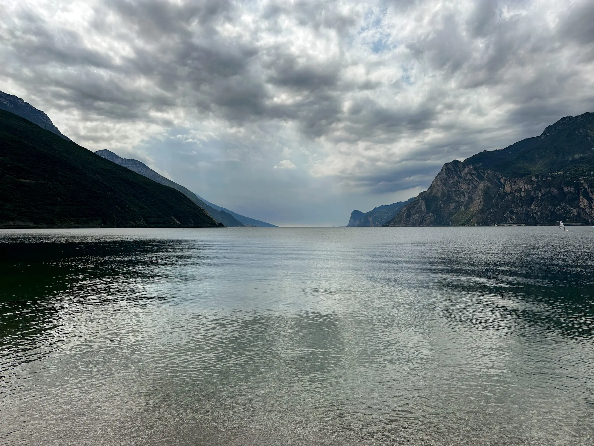 View over Lago di Garda from
Riva.
View over Lago di Garda from
Riva.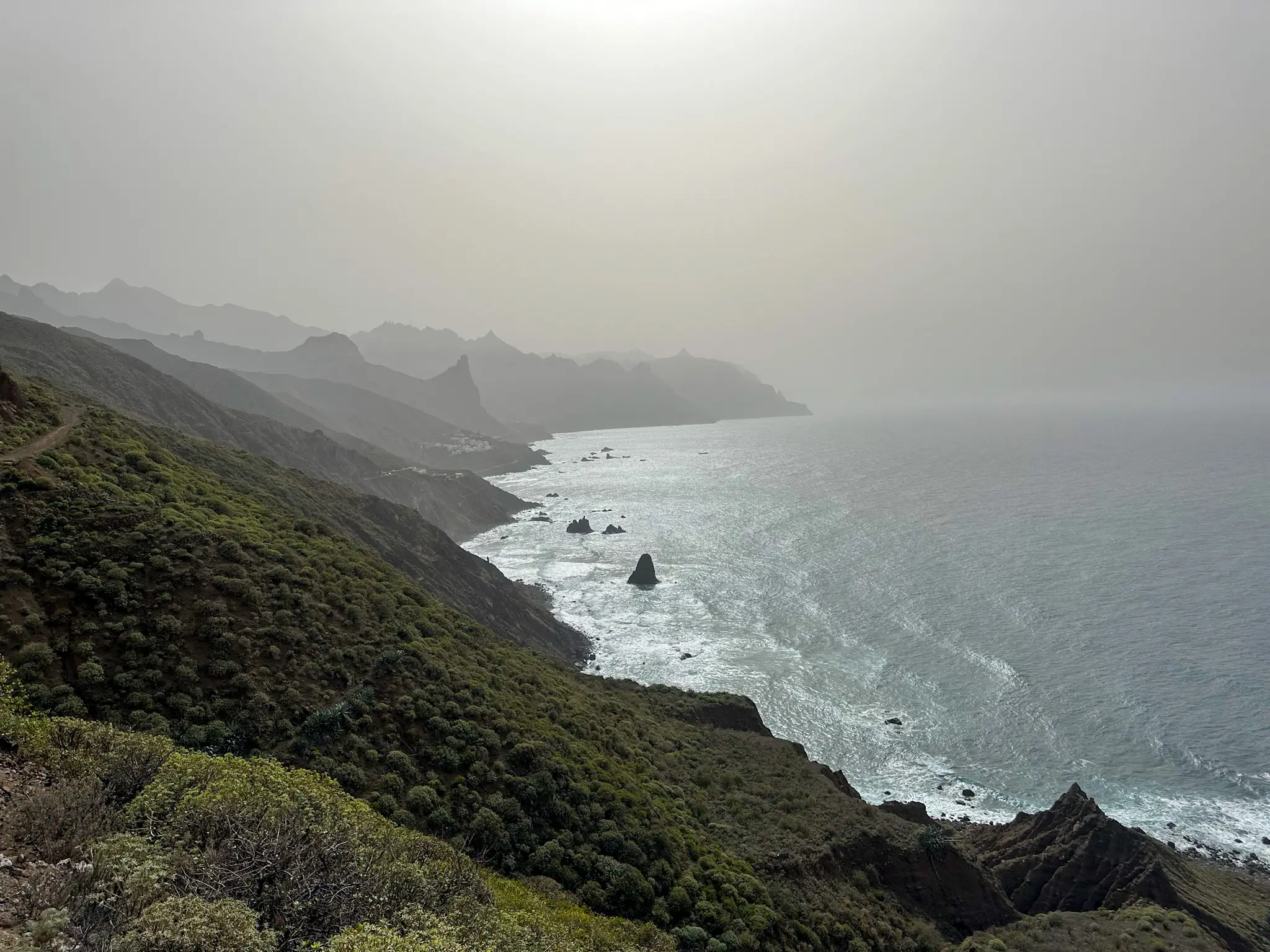 Rural Park of Anaga view near
the ocean.
Rural Park of Anaga view near
the ocean.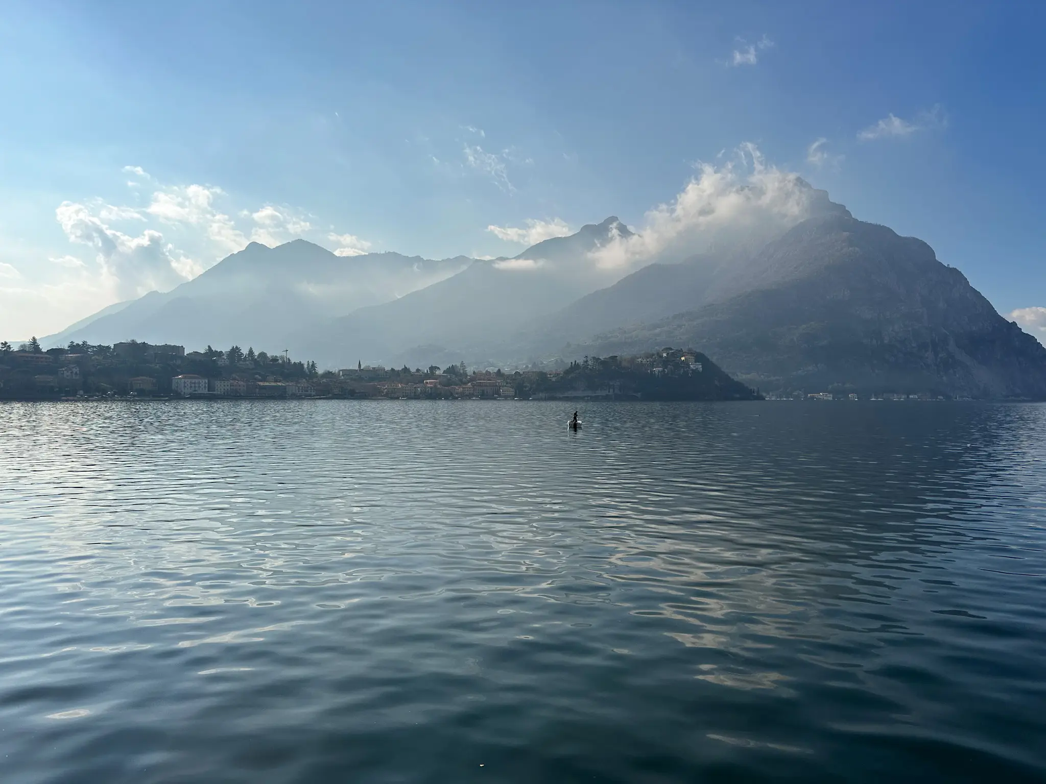 Lecco view of the Lake
Como.
Lecco view of the Lake
Como.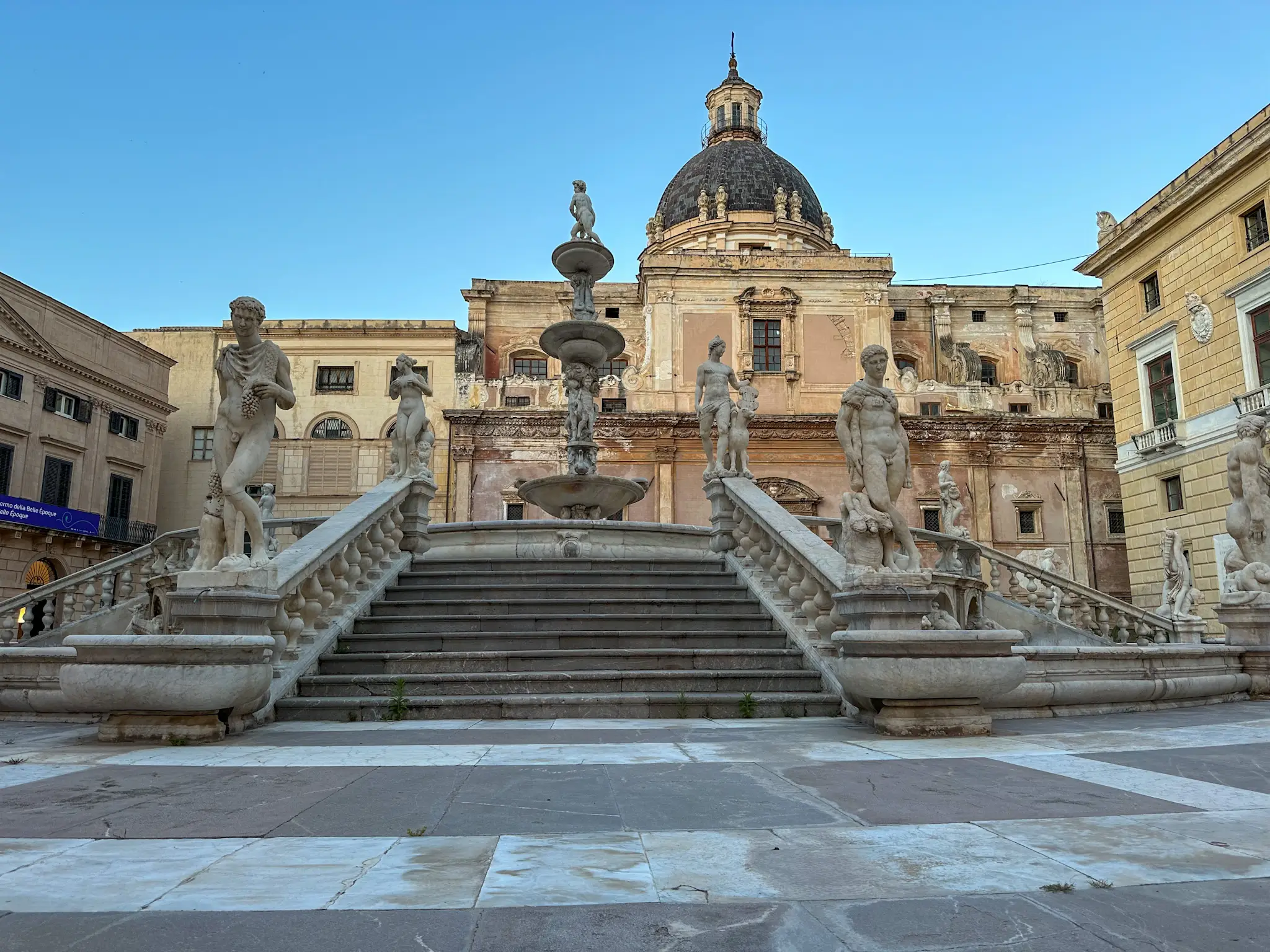 The Praetorian Fountain in
Palermo.
The Praetorian Fountain in
Palermo. The Odeon of Herodes
Atticus.
The Odeon of Herodes
Atticus. Hilly Landscape in the Village
of Şimon.
Hilly Landscape in the Village
of Şimon.